Reduce to character
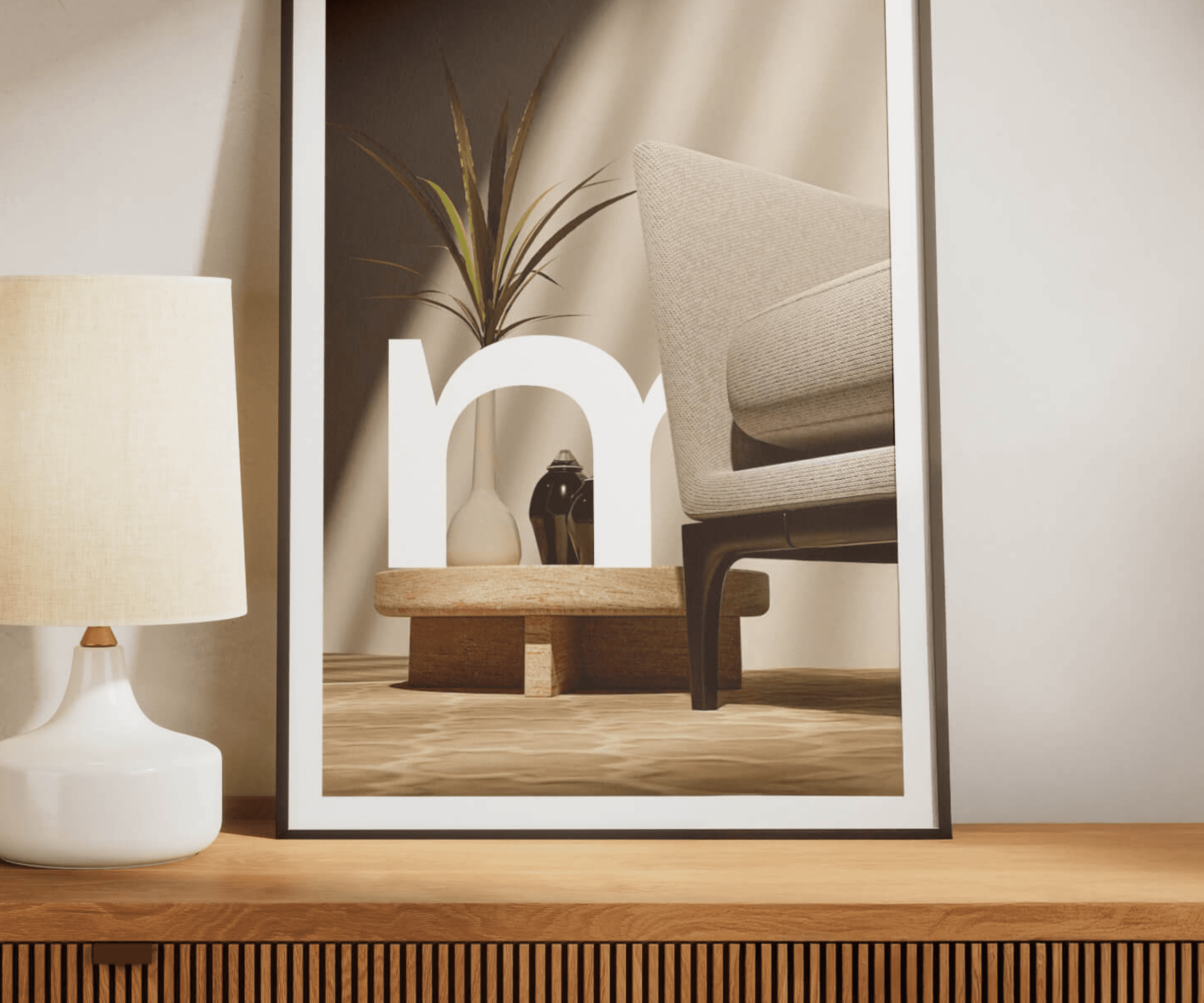
Restrained forms and refined typography shape a logo that feels calm, memorable and comfortable beside the products.

Home & Living / Brand + E-commerce
A calm identity that lets thoughtful objects take center stage.
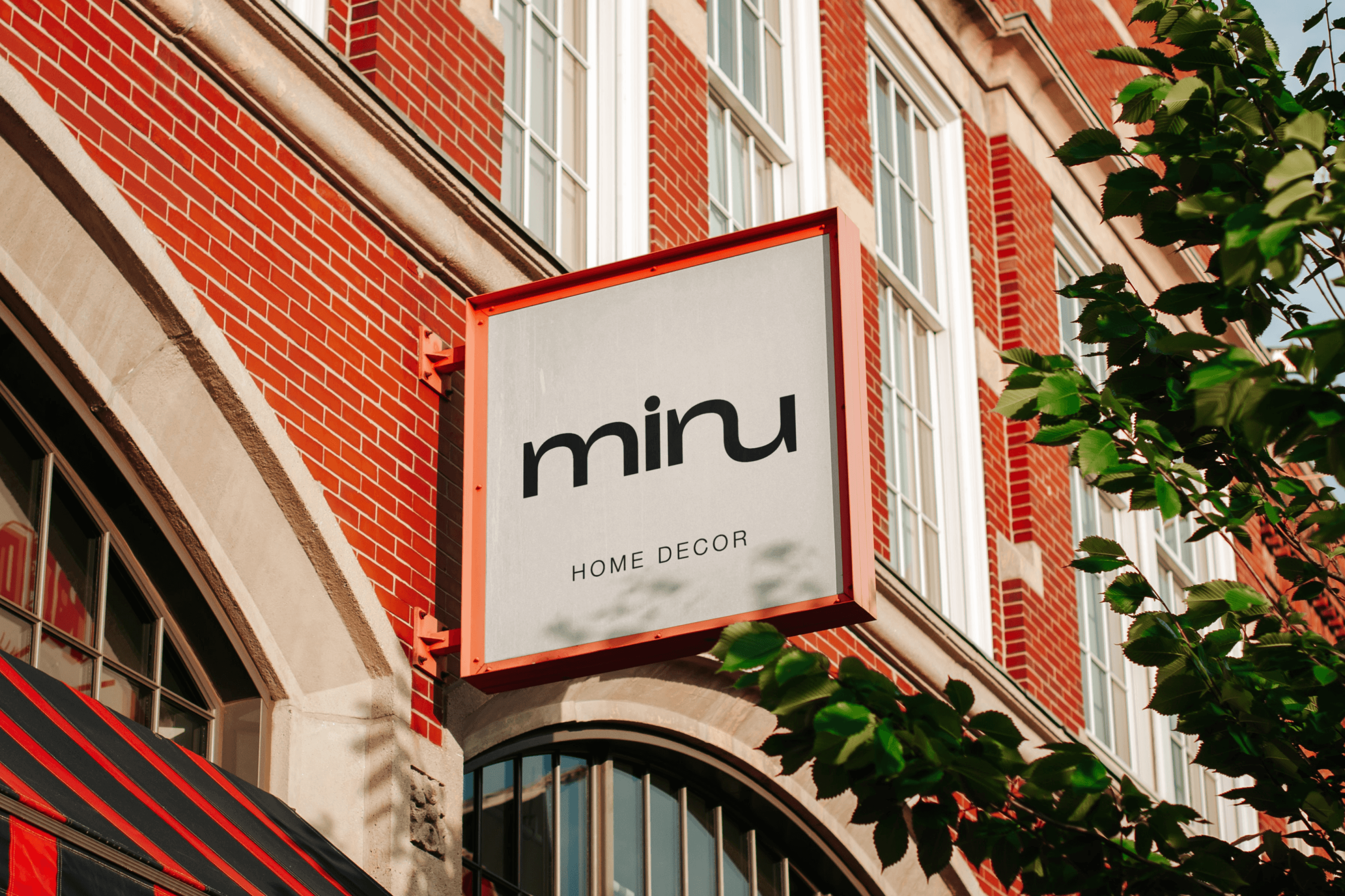
01 / Project Introduction
Minu is a contemporary home décor brand shaped by minimalist design and thoughtful craftsmanship. The identity needed to elevate the perceived value of each object without competing with the quiet character of the products themselves.
02 / Challenge + Opportunity
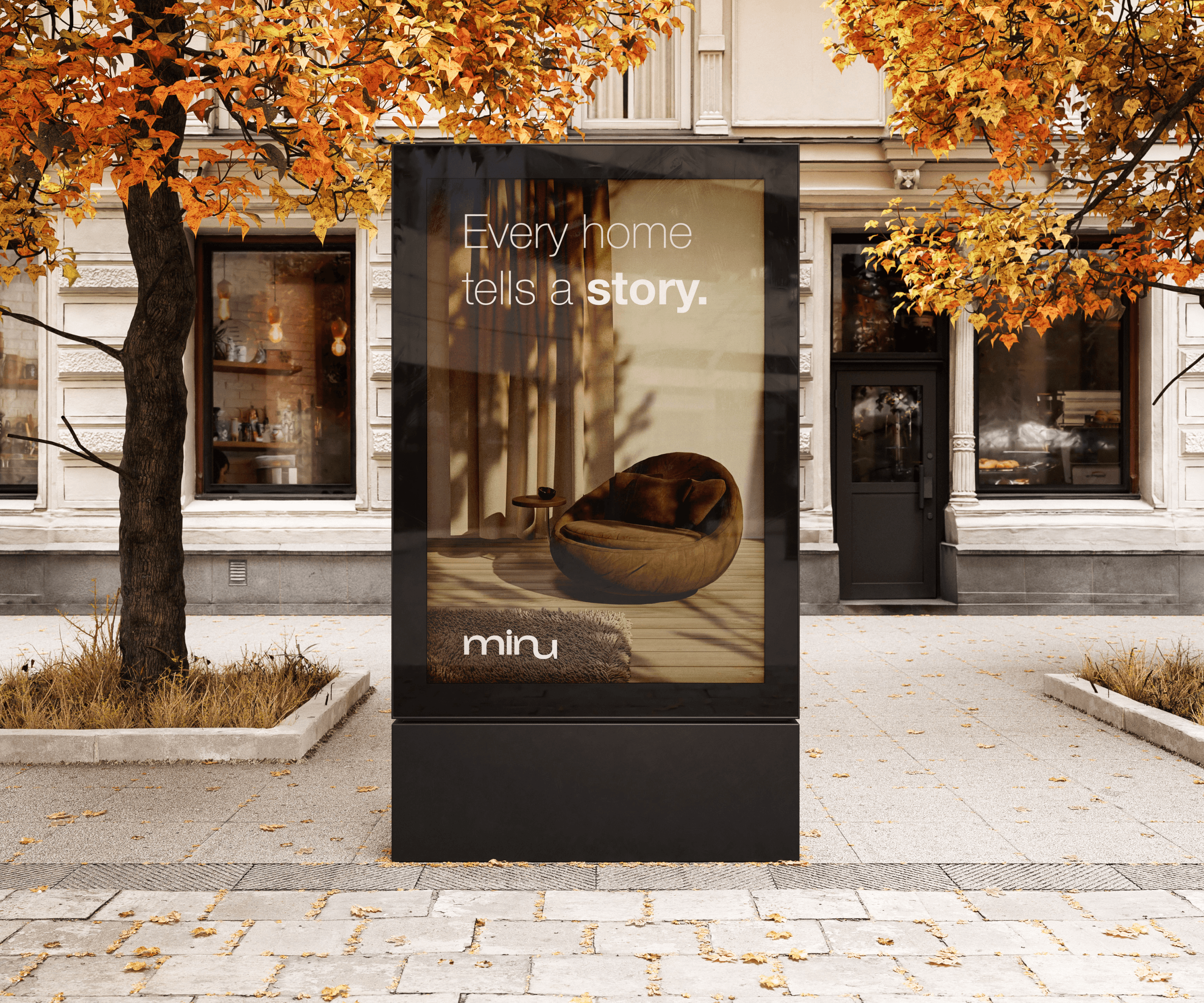
A timeless visual language could connect physical craft and digital retail, creating a consistent atmosphere wherever customers encounter Minu.
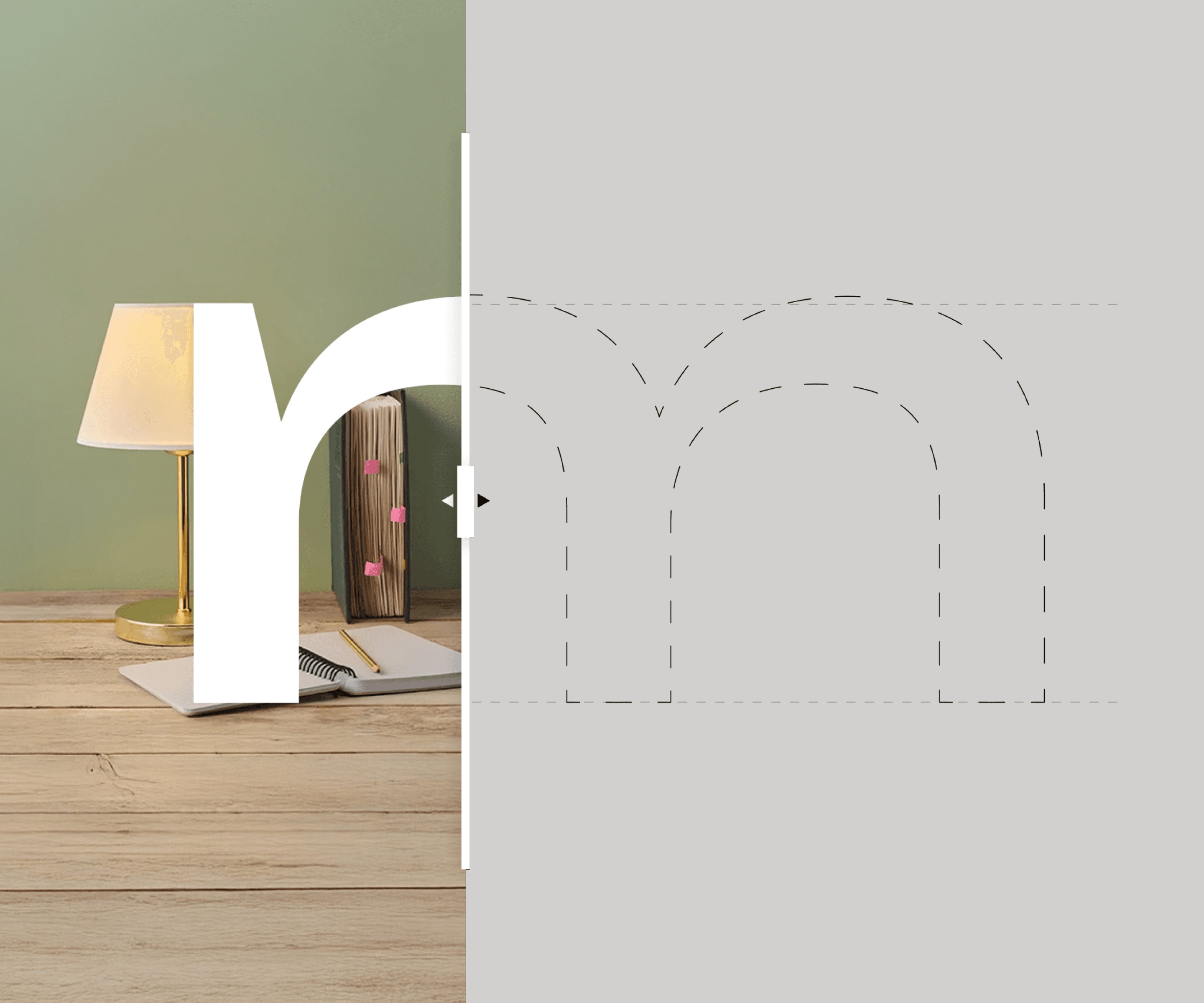
03 / Strategy + Approach
Restrained forms and refined typography shape a logo that feels calm, memorable and comfortable beside the products.
Neutral, nature-inspired tones add warmth and balance while complementing interior environments.
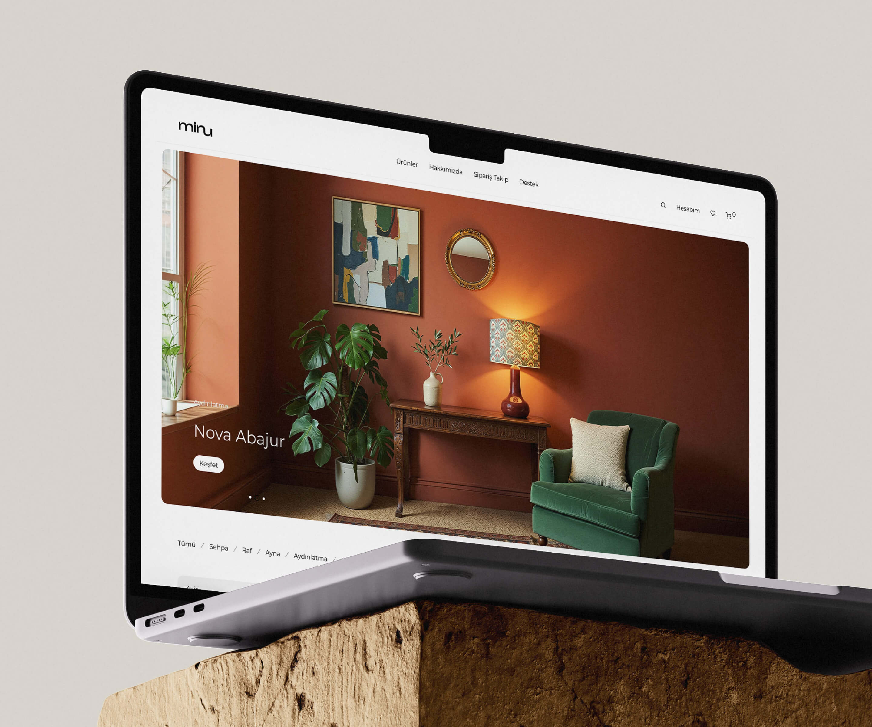
Editorial scale, measured whitespace and a clear commerce hierarchy keep attention on material, form and detail.
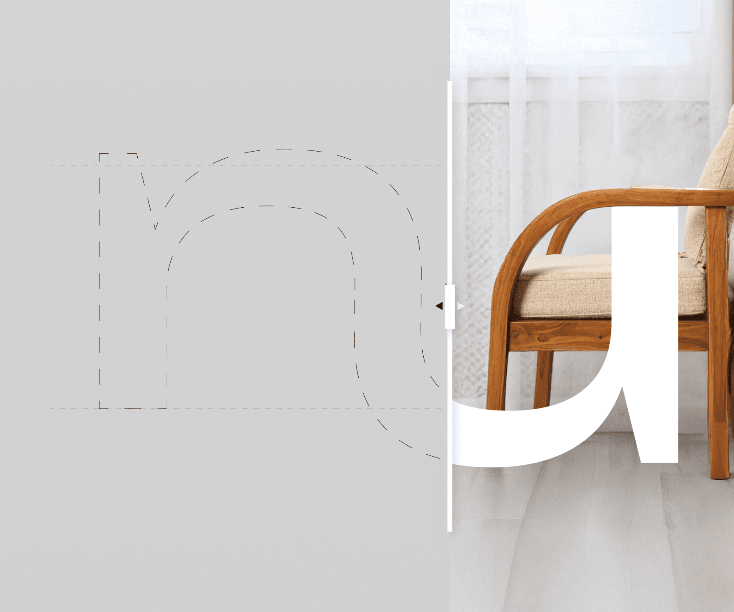
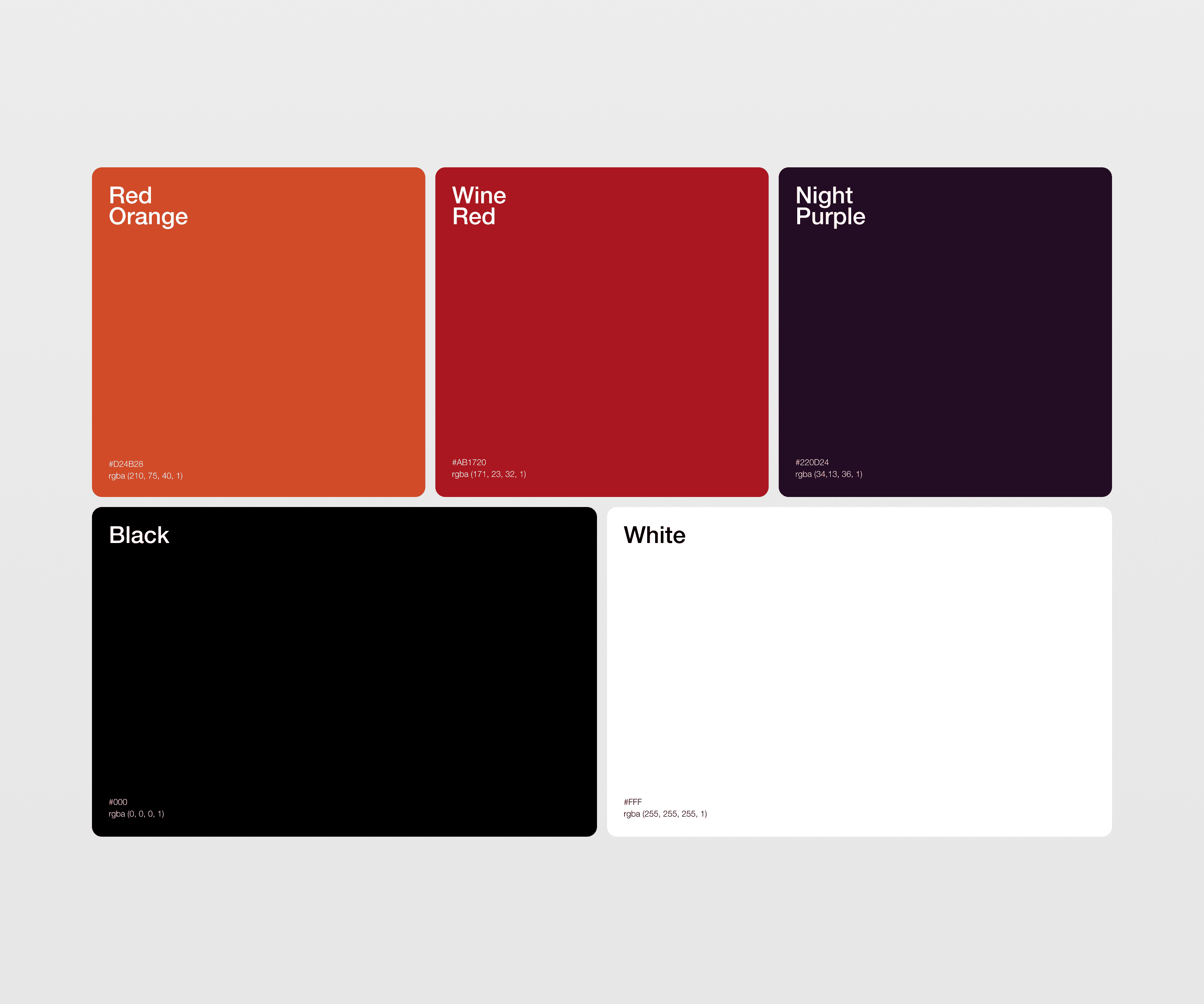
04 / The System
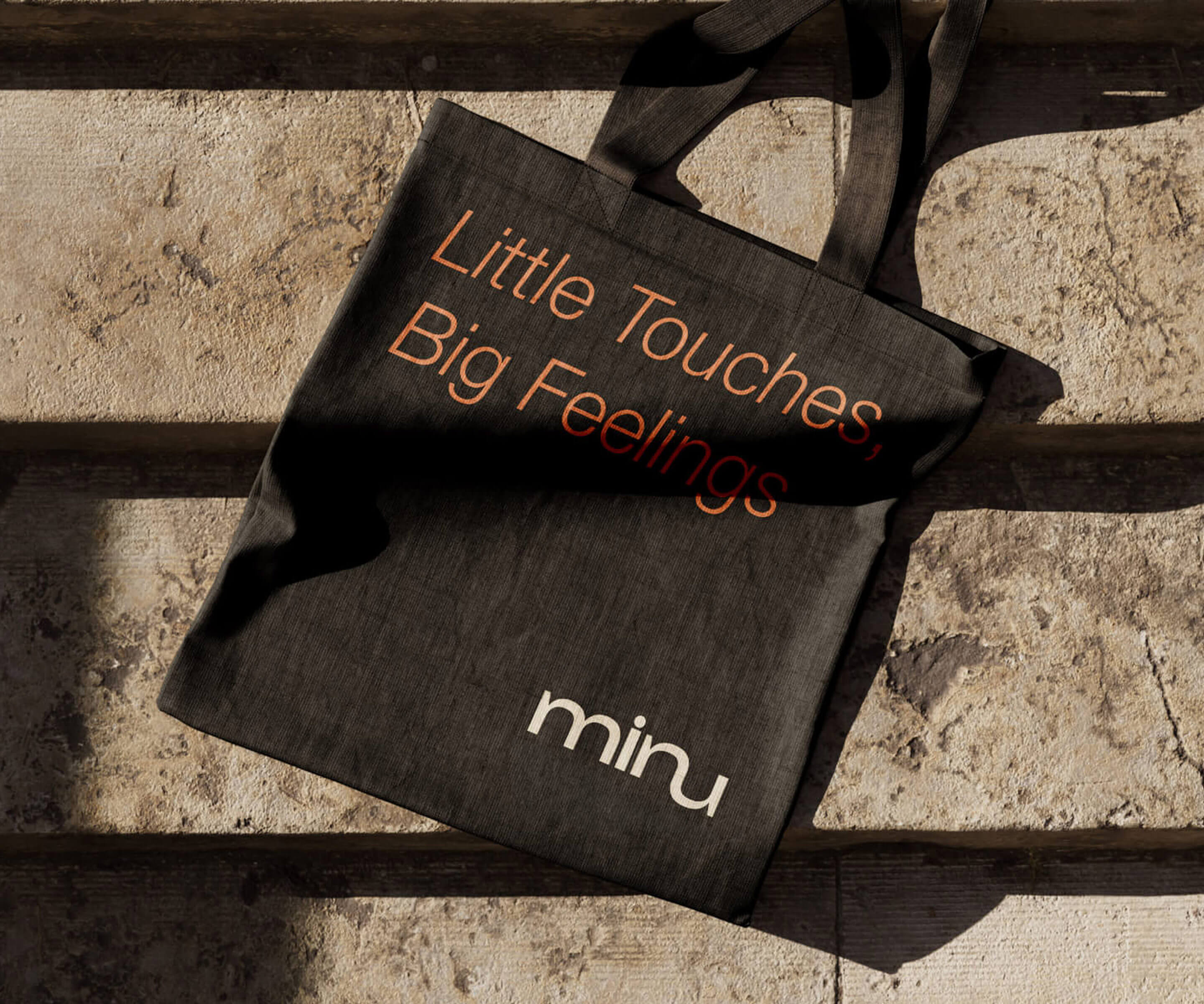
The identity combines a minimal mark, refined typography, earthy color and product-led art direction. Its restraint creates consistency without making every application feel identical.
05 / Outcome
Minu emerges as a more cohesive and recognizable design brand, connecting craftsmanship, product presentation and e-commerce in one calm experience.
Next move / Yours
Let’s build something meaningful.
Start a project ↗