Circle
The circular form represents wholeness, continuity and breath—the steady foundation of the practice.

Wellness / Brand Identity
An identity shaped by breath, movement and natural balance.
01 / Project Introduction
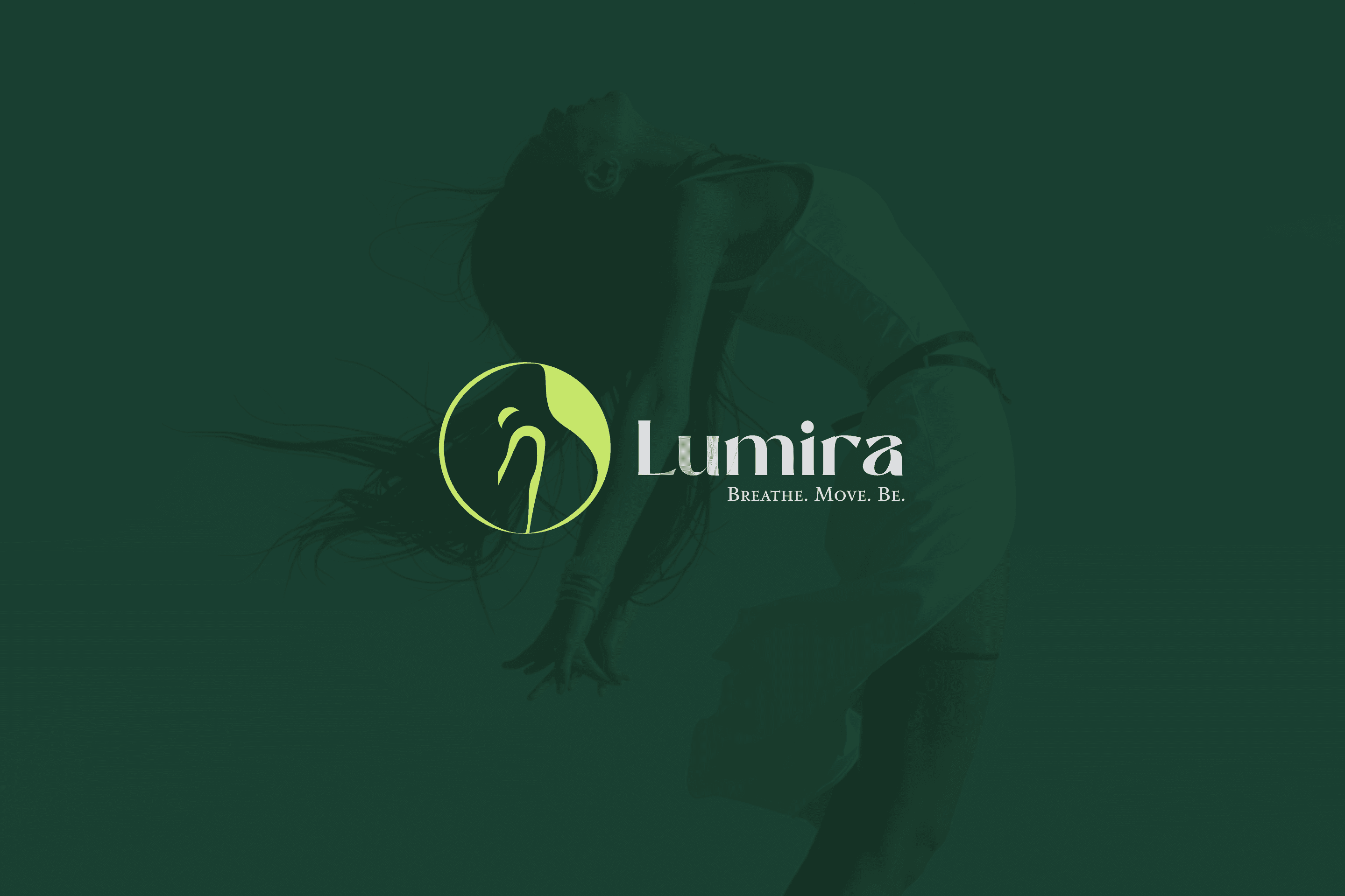
Lumira is a modern yoga and wellness brand that brings mindfulness practice into urban life. The identity connects breath, movement and mental balance in a visual language that feels simple without becoming passive.
02 / Challenge + Opportunity
A single, carefully constructed mark could make Lumira instantly recognizable while holding several connected meanings within one continuous gesture.
03 / Strategy + Approach
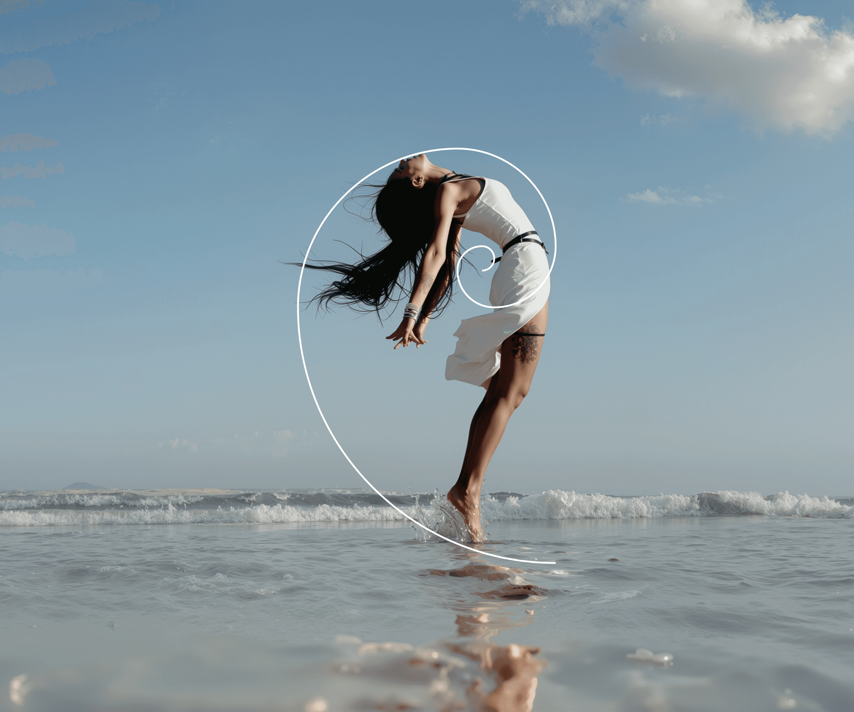
The circular form represents wholeness, continuity and breath—the steady foundation of the practice.
An abstract human presence introduces movement, body awareness and flow without becoming literal.
A deliberately imperfect balance makes the symbol feel natural, open and alive.

04 / The System
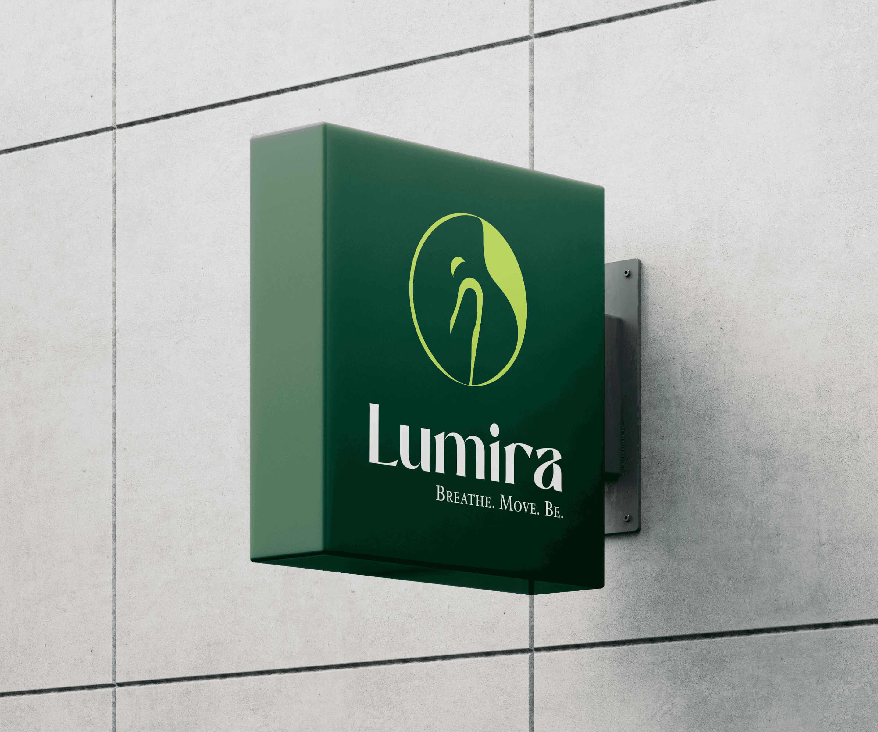
The mark’s circular rhythm creates an anchor for typography, color and application. Its open form gives the identity spaciousness while its asymmetry preserves movement and character.
05 / Outcome
Lumira gains a focused and recognizable wellness language—calm enough to support mindfulness, distinctive enough to hold its own in an urban context.
Next move / Yours
Let’s build something meaningful.
Start a project ↗